
This post may contain affiliate links. I only recommend products I use and love. Read the full disclosure here
Updated on: September 29, 2026
Originally published on: September 29, 2026
Classic patterns in modern interiors, including florals, stripes, checks, damasks, and scrolling botanical motifs, can make a room feel refined. The problem isn’t that these patterns are old-fashioned. They can simply feel heavy when other design elements in the space repeat the same period or level of detail.
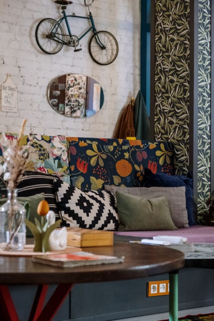
A modern interior gives traditional patterns a different role. You can modernize them by using them as a point of contrast against simpler shapes, calmer color fields, and contemporary materials. This keeps the character of the motif while giving the eye somewhere to rest.
Start With One Pattern, Not a Theme
Choose one patterned element to lead the room before adding anything else. It might be curtains, an upholstered chair, a rug, or wallpaper. Starting with one “hero” pattern gives you a set of colors, shapes, and proportions to work with.
When comparing heritage botanicals, examples such as William morris fabric by Terrys can provide a useful visual reference for seeing how scale and colorway change the character of a traditional motif.
Once you’ve chosen the lead pattern, you don’t need to repeat the style everywhere. One element can carry most of the decorative detail.
Let Color Do the Modernizing
Color can transform a familiar pattern and give it an entirely different feel. Olive green and tobacco brown can create a traditional ambience, while the same motif in chalky blue or cream feels much lighter.
You can make it work by pulling a background color and an accent color from the pattern and using those colors throughout the room. For example, if your curtains have navy leaves on an ivory background, an ivory or navy sofa with a pale oak side table can connect the pattern to the room without overusing the print.
Mix Scales Instead of Matching Motifs
You can use more than one print in a space, but changing the scale helps everything feel balanced. Use a large botanical print with a narrow stripe or small checkered pattern. Interior designers also recommend varying pattern sizes so competing prints don’t demand the same amount of visual attention. Two dense, medium-scale floral patterns can be more difficult for the eye to separate.
Break your patterns down into large, medium, and small scales. Your dominant print might be large, your secondary pattern medium, and your smallest pattern something simple and geometric. Use solids between them to create balance.
Give Pattern Some Breathing Room
Classic patterns often feature dense repetition, which makes the plain areas surrounding them important for balance. Simple cabinets and plain walls provide visual breaks that keep patterned motifs from taking over a modern interior.
Remember, one large-scale pattern on a single surface can feel cleaner than several small patterns scattered throughout the space.
Combine Ornate Prints With Clean-Lined Furniture
One of the easiest ways to modernize a heritage pattern is to pair it with furniture that has a clean, straightforward silhouette. A floral fabric feels more relaxed on a boxy bench, slim Roman shade, or simple cushion than on an elaborately shaped piece.
Warm wood, brushed metal, linen, matte ceramics, and natural stone work well with traditional patterns because they add texture without adding more visual complexity.
Repeat Colors, Not the Pattern
Design elements come together when they relate to one another, but they don’t need to match exactly. If a patterned chair has rust, blue, cream, and green, choose one or two of those colors for nearby furniture or decor. There’s no need to repeat the same print on curtains and lampshades.
Pick up the green in a ceramic vase, the cream in a rug, or the rust in a throw. The eye will make the connection, giving you cohesion in the room without turning the pattern into a theme.
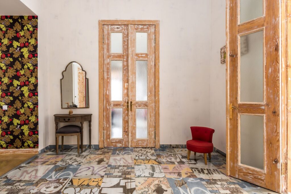
Use Pattern With Scale and Lighting in Mind
Think about viewing distance and lighting before you commit because both can influence how a pattern looks. A tiny repeat can appear like a solid color from across the room, while a large repeat may show more detail when you step further back.
A fabric that looks crisp in daylight can feel much deeper under warm evening lamps. Move the sample around the room for a few days, checking it in the morning, afternoon, and evening light.
If you’re pattern-shy, start with something easy to change, such as a cushion cover, lampshade, framed textile, or small stool. If you already know you love the motif, curtains or larger upholstery can give it enough surface area to show the repeat properly.
For inspiration, the Victoria and Albert Museum’s William Morris collection shows how historic botanical and repeating patterns have been used across textiles, wallpaper, and interior design.
Conclusion
You can still use classic patterns in modern interiors. They just need the right setting. Start with one strong motif, edit the palette, vary the pattern scale, and give detailed prints room to breathe. Then use modern furniture shapes and solid colors to create contrast.
The most successful rooms use layering to give old and new elements different roles. A classic pattern can provide the character, while a modern interior provides the clarity.