This post may contain affiliate links. I only recommend products I use and love. Read the full disclosure here
Updated on: June 17, 2026
Originally published on: June 17, 2026
Choosing the right bedroom color scheme isn’t just about decorating. Color has a huge impact on how a room feels, and since your bedroom is the one place designed for rest and relaxation, it’s worth putting some thought into your palette.
Pulling a color scheme from another room in the house without considering how it will work in the bedroom is one of the easiest ways to end up with a space that never feels quite as peaceful as you’d hoped.
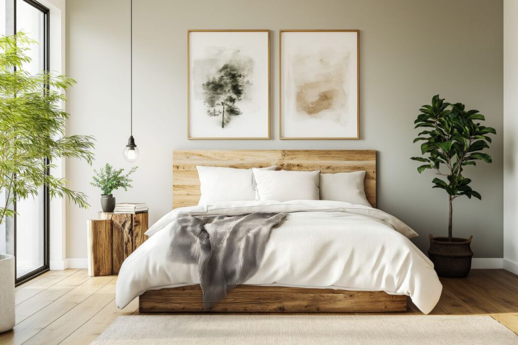
Layer One Color Family, Led by the Bed
One of the easiest ways to create a calm, cohesive bedroom is through tonal layering. Rather than matching everything perfectly, which can feel flat, or introducing several competing colors, which can feel busy, choose one color family and work with a range of shades within it.
Soft grays that range from pale to charcoal create a soothing look. Warm neutrals that move from cream to clay can make a room feel cozy and inviting. The room feels more pulled together because everything works together instead of competing for attention.
The bed is the largest single block of color in most bedrooms, which means it naturally helps define the entire space. This is where bedding in tones that pull a bedroom together does a lot of the heavy lifting. The comforter, pillows, and throw blankets often cover more visual space than any wall.
When those tones stay within the same color family, the entire room feels more intentional and complete. The walls may set the backdrop, but the bed is usually where your eye goes first.
Mind the Undertones
Undertones are often the small detail that separates a bedroom that feels calm and relaxing from one that feels slightly off.
Grays can lean blue or green. Whites can feel warm or cool. Beiges can have pink or yellow undertones. Understanding how undertones affect paint colors can make it much easier to create a palette that feels cohesive instead of slightly off.
Before making a final decision, compare samples together in the room itself. Look at them in both daylight and evening light. Taking the time to do this can help you spot clashes before they become permanent.
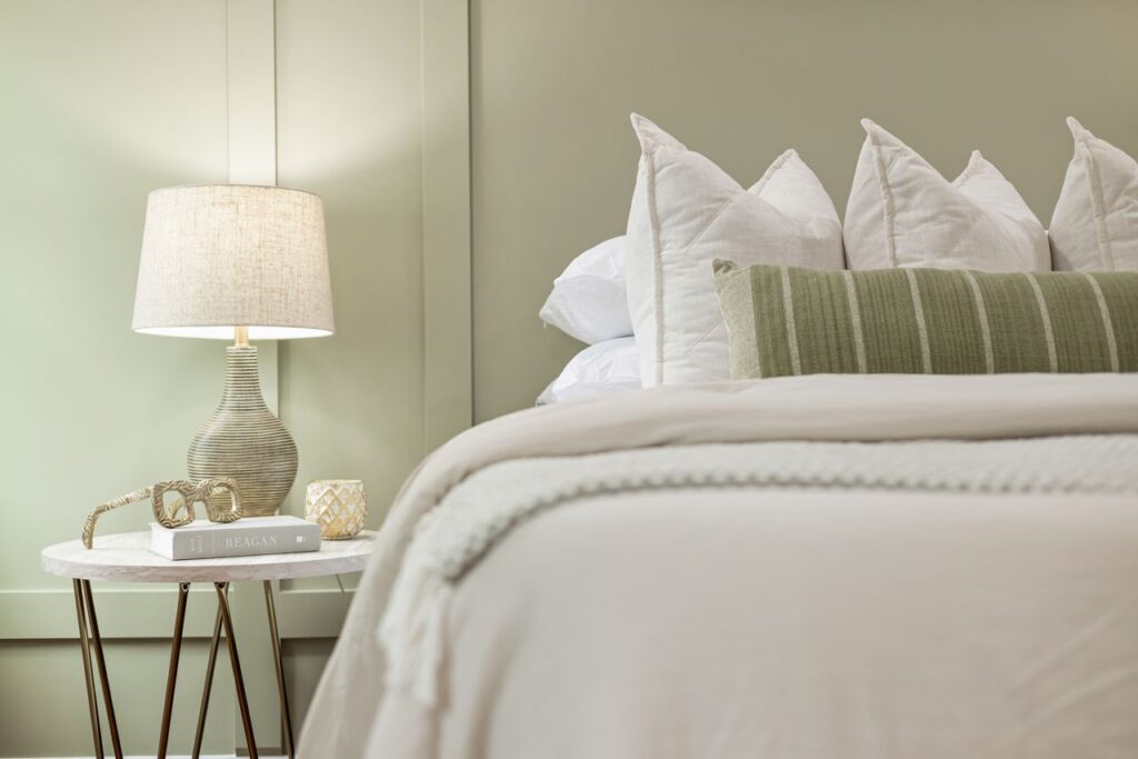
Saturation and Texture
The intensity of a color deserves just as much attention as the color itself. Bright, vivid shades tend to feel energetic, which is usually the opposite of what you want in a bedroom. If you’re looking for depth or drama, it’s often better to go darker within the same color family rather than brighter.
A deep navy or rich charcoal can feel cozy and restful, while a bright version of the same color may feel much more stimulating. The goal is to create a space that encourages relaxation rather than demanding attention.
Texture also plays a big role in the overall feel of a room. The same shade can look completely different on a matte wall, soft cotton bedding, chunky knit throw, or smooth linen fabric. Layering different textures within a tight color palette adds depth and interest without introducing more colors to manage.
A monochromatic room doesn’t have to feel boring. When different textures catch the light in different ways, the space feels rich and inviting while still maintaining a calm atmosphere.
Light, and What Is Already in the Room
Natural light should have a major influence on your color choices. A north-facing room receives cooler, bluer light, which can make cool grays feel chilly and less inviting. Warmer tones often work better in those spaces. A south-facing room receives warmer light and can usually handle cooler shades more comfortably.
Testing colors in the actual room at different times of day can prevent the disappointment of choosing a shade that looked perfect in the store but feels completely different once it’s on the wall.
It’s also important to consider the elements that are already in the room. Looking at a variety of bedroom design ideas can help you see how flooring, furniture, window treatments, and color palettes work together to create a cohesive space.
Flooring, curtains, furniture, rugs, and other larger pieces all bring their own color and undertones into the space. A palette chosen without considering those elements can quickly fall apart.
The most successful bedroom color schemes take existing features into account and work with them rather than against them.
A Simple Order to Follow
A simple process can make choosing colors much easier. Start with the dominant shade, usually the color that will appear on the walls and largest soft surfaces. Next, choose one or two supporting shades from the same family for bedding and textiles. Finally, decide whether an accent color is necessary at all and, if it is, use it sparingly.
Building the palette from the largest elements down to the smallest helps keep everything balanced and cohesive.
How to Add Color Safely
If you’re hesitant to commit to a fully tonal color scheme, there’s an easy way to add color without sacrificing the calm feel of the room.
Keep the larger, more permanent elements, such as the walls, flooring, and bed, within a neutral color family. Then bring in color through smaller accessories like throw blankets, decorative pillows, or other easy-to-swap accents.
A soft green in spring or a deeper shade during the winter can add personality without changing the foundation of the room. This approach gives you flexibility while preserving the peaceful atmosphere you’re trying to create.
A Room That Calms
The goal of all of this is simple: create a bedroom that feels relaxing the moment you walk through the door. Keep your palette focused, pay attention to undertones, layer textures, and let the bed help anchor the design.
The best bedroom color schemes don’t demand attention. Instead, they quietly do their job, helping create a comfortable, welcoming, and restful sleep environment you’ll enjoy every day.